Krea University

Learning without limits

Krea University is designed to prepare students for the unprecedented challenges of the 21st century. The University pioneered the concept of “Interwoven learning”, that merges together the arts and sciences, creativity and action, eastern and western perspectives. It draws upon the profound learnings of the past and present, to ready students for the future.

Translating a vision

Right from the logo, every element of the Krea communication had to reflect the higher purpose of the institution. It had to enhance Krea University’s core promise – creativity in action. It had to be young yet capture the sense of gravitas and timelessness that befits an institute of higher learning.

Bringing it together

The logo and visual mark were created using vivid shades of blue, designed to appeal to the thinking and aware student of today. The motif captured the idea of interwoven learning, collaboration, co-creation and innovation. All branding elements were crafted to reflect the hallmarks of Krea University – openness, flexibility and accessibility.

The brand in action

The visual language of Krea University had to be unique and memorable; as various audiences interacted with the brand, like students, parents, faculty, partners, employees and more. The idea had to be universally understood and strong enough to extend across various media, both online and offline.

The team honed in on illustrations as the main theme, working with international artists to create a customised set. The bank of vivid and subtle illustrations interlaid with Krea’s chosen typefaces, gave rise to a dynamic brand look that showcased various perspectives and scenarios.

University Colours!

Brand Krea stood out from day 1, using a consistent approach to its communication. The visual style, language and tone of voice, shaped the website, social media posts, and all communication material.

Thinksynq

The thinker-doer dilemma

Thinksynq was a unique player in the world of consultants, software specialists and outsourced solutions providers. The team had a wealth of strategic and tactical expertise, perfectly at home with both big picture scenarios and detailed executions. While the company name captured their USP to some extent, the brand communication had to be differentiated and in sync with their DNA.

Getting out of the boardroom

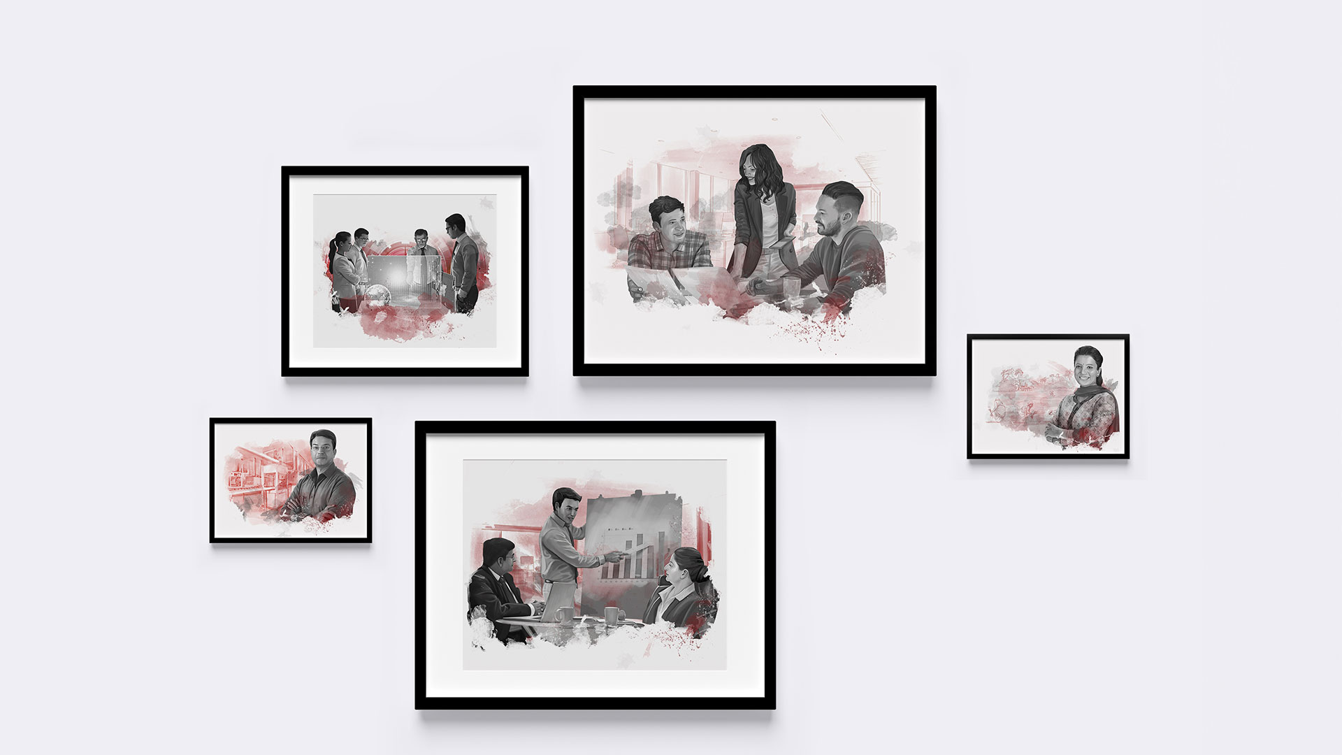
Moving away from consulting stereotypes of glass panelled conference rooms and suit wearing executives, we gave brand thinksynq a very relatable look and feel. Across the website and communication, we used realistic illustrations and familiar looking faces. The idea was to show people who would roll up their sleeves and partner their clients all the way through. 

The language used on the site was also simple, minimal and free of numbing jargon. The team built on the catchphrase “business practitioners”; to firmly establish that thinksynq had been there and run that!

Think simply

The brand’s signature style encompassed all elements. The naming hierarchy for its products was established with each new launch contributing back to the mother brand. Team Rubecon went further and designed all of the product interfaces in the standout red-grey thinksynq colours. 

Extensions? Yes please!

As the brand grew, interesting extensions became possible, thanks to the strength of the core idea – a no-nonsense, hands-on and practical approach to even the most complex business challenges. 

Our team created a unique comic strip “Megacawrp”, which was a hilarious take on CEO mindsets, CFO challenges, investor expectations, founder personalities, HR tangles & more. It helped the brand connect to small and medium enterprises thanks to the warm, insightful and friendly humour of the content. 

Safe Harvest

A wholesome supply chain

Safe farming promotes safe eating. It protects the interests of both consumers and thousands of small and marginal farmers. Safe Harvest, a pioneering company, works in this space, sourcing staples directly from small farmers, mainly women, through a network of Farmer Producer Organisations. The produce is then subject to over 120 stringent tests to ensure there is zero pesticide residue; and the food retains its entire nutritional value.  A win-win model, but one that was virtually unknown. 

Confusion in the kitchen

While clean, healthy eating had become a priority among Indian families, there was little awareness of the choices available. Many paid hefty prices for the organic label. The communication task was multifold – seed the concept of pesticide-free while linking it firmly with brand Safe Harvest and women farmers. At every touch point, consumers should be made aware of this chain of goodness and the ripple effect of picking Safe Harvest.

Let’s start with field work

The core idea of Safe Harvest was rooted in the fact that it directly sourced various grains, spices and herbs from 12 Indian states and over 1,00,000 farmers. Our farmers were not just producers but protectors of a more sustainable and kinder way of agriculture, one that guarded the eco-system, their own well-being and the health of the end consumers. 

To make every user experience this, we transported them to verdant fields, cool slopes and  leafy woods, where they could share the harvest with smiling farmers. We introduced these elements in the packaging and followed it up with strong, emotive communication on the website, creating a unique connection from the word go.

Pesticides…quite the mouthful!

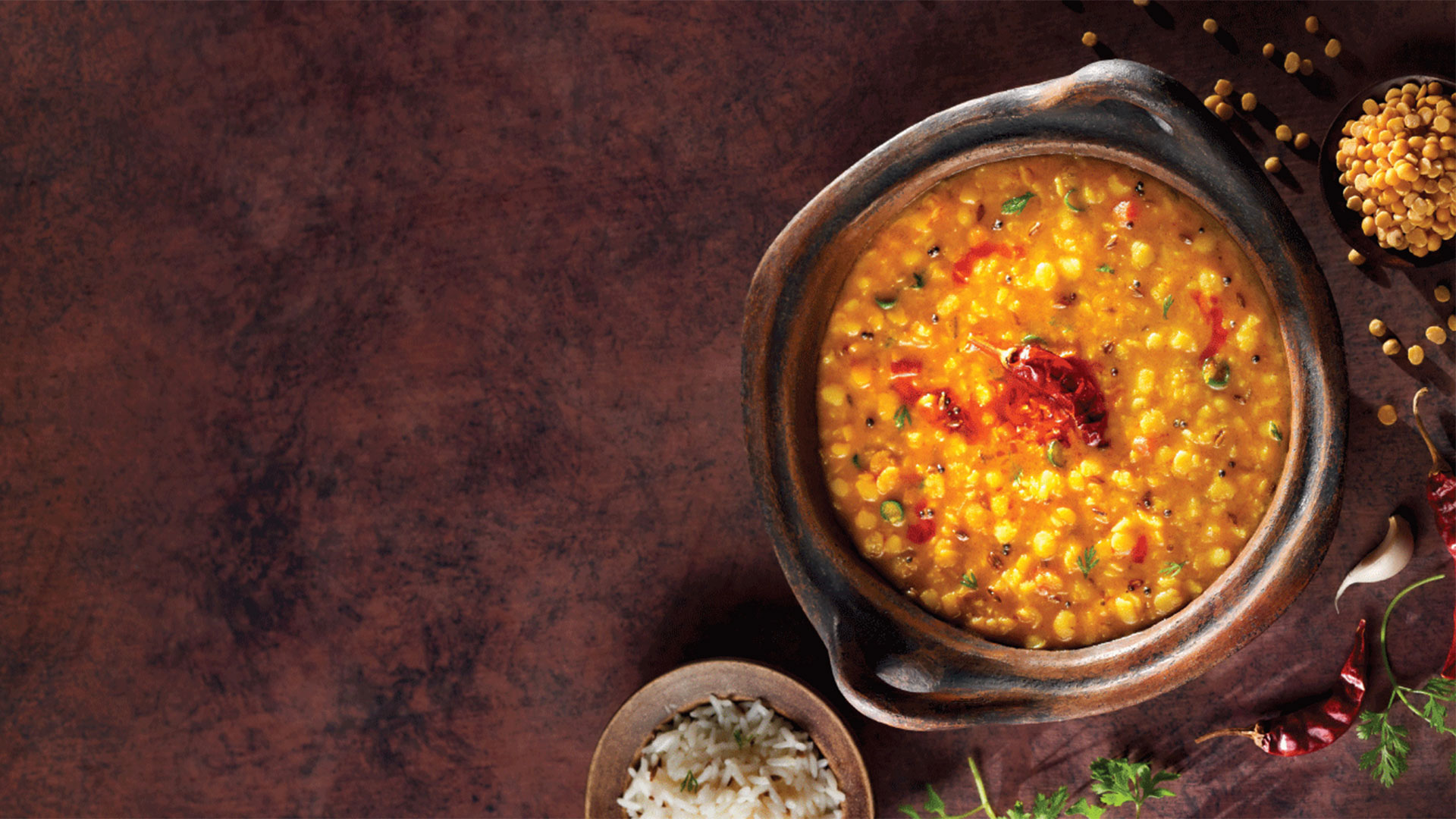
We still had a way to go to make pesticide-free a key word and thought in our consumers mind. As part of a powerful launch communication; we decide on a simple tack – pesticides sound horrible, imagine how they would taste? We juxtaposed delicious food shots with headlines that highlighted the most common pesticides used. Disruptive, provoking and highly effective. Consumers would never look at their everyday menu in the same way again!

Safe and happy, all the way

The Flying Elephant

Cooking up something new

The Flying Elephant was started with a view to giving fine diners an experience like no other. Part of the restaurant’s strategy was to keep things fresh – from the ambience, the service and of course, the menu. After helping the brand take off with a launch campaign, we were called in to redesign their menu – on two separate occasions. 

Fine dining at its finest

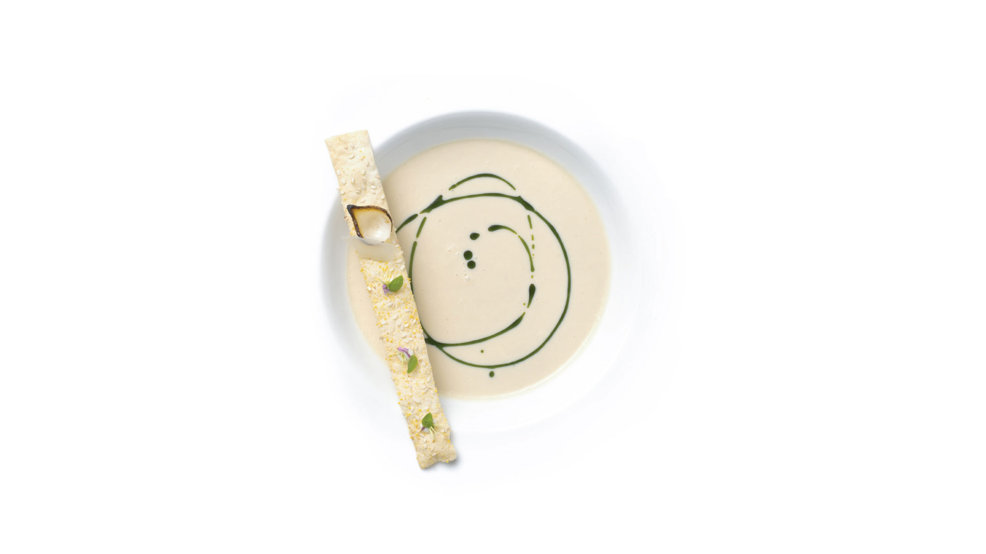
We started off by paying homage to the spirit of fine dining and created a menu language that was unmistakable gourmet. By showcasing the food, fresh ingredients and cutting-edge plating techniques, we took classical foundations and gave them a modern interpretation. The result was a mixture of art and gastronomy. 

Into the mind of the chef

Next on The Flying Elephant’s ever-evolving agenda was to go beyond fine dining into a more experiential space, without giving up its culinary edge. To underscore this next step, we designed a menu that mirrored the diary of a chef and created pages to look like they were lifted straight out of the creator’s journal. 

The illustrative route opens a window into the mind of a chef, showing us their thoughts, ideas and recipes. We also picked certain spotlight dishes and broke them down to their important parts, just like how a chef would in the process of experimenting on and perfecting an idea.

Hatsun

Think dairy, think Hatsun

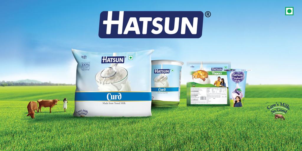
The brand introduced a range of products like Curd, Paneer, Cooking & Table Butter, Yoghurt, Yoghurt Milk Shakes, Milk Beverage, Dairy Whitener and Skimmed Milk Powder to name a few. The products were made available in handy sizes and packaging formats.

Today, Hatsun is a national brand that is growing at a steady pace. 

Cow’s milk – oh so good!

The brand philosophy and communication of Hatsun stems from the product essence itself. 

Milk sourced from quality cows that are reared in the pastoral heartlands. Fed on lush green grass, drinking clean water, breathing in crisp fresh air and basking in golden sunlight, the cows provide creamy, frothy milk that goes into the making of every dairy product of Hatsun.

A world of its own

With the brand’s DNA framed so clearly, the next logical step was to create the world of Hatsun. We worked on bringing alive the magical, sun-kissed pastures, the rolling green hills, blue skies and pristine water bodies, in every piece of communication. 

A drop, an identity

Since delicious, nutritious milk was at the heart of Hatsun, the packaging used a single milk drop as the main visual identifier. The milk drop wrapped itself aesthetically around various products, placed on Hatsun’s signature landscape. Every element of design was crafted to evoke and enhance the Hatsun experience. 

How about a little teleportation?

We wanted our customers to immerse themselves in our world, a dream-like world of picture perfect meadows, sky and cows. The main communication used a smart, teleportation device that strongly associated brand consumption with nature, freshness and bliss. The brand’s signature track also became an integral part of the feeling that the communication tries to evoke. 

The tactical communication while visually in the same space, focussed on usage occasions, product attributes and habits.

The result of these strong and consistent brand linkages led to Hatsun establishing itself very quickly in a competitive market place, and occupying a distinct space in the consumer’s mind. 

It also set up the perfect platform for launching new products in the Hatsun portfolio

Marching ahead

Brand Hatsun will always operate from a  deep understanding of customer needs. The portfolio keeps evolving to meet changing consumption patterns and demand. Whether it’s 99% fat-free skimmed milk or yummy, healthy yoghurt shakes, a Hatsun offering will always be on hand!

Nippon Paint

How Asia’s Real No. 1 Paint became the real top of mind in India!

An international name

Nippon Paint traces its origins back to Japan in 1881, where it emerged as the pioneering paint manufacturer—the first of its kind in the nation. Headquartered in Osaka, Nippon Paint ascended to the pinnacle, earning the accolade of being ranked as Asia’s No. 1 paint company. The ripples of its influence extend across continents, captivating hearts in Asia, North America, Australia, and Europe. The essence of Nippon Paint’s expertise is encompassed within its ability to provide comprehensive paint solutions for diverse surfaces, be it automotive, marine, protective, decorative, or industrial. 

Footprint in India

For 17 years, Nippon Paint India has been an integral part of the nation’s canvas, nurturing growth and progress. It has woven a sprawling network of over 3000 depots, forming a robust infrastructure that spans the length and breadth of the country. Collaborating with a dynamic alliance of 5000-7000 dealers, Nippon Paint India resonates across different states in the country.

Rewind – 2016

To understand the paint category, we got down to some good old fashioned research 

The journey of transformation began in 2016, where a comprehensive brand assessment unfolded revealing interesting insights. The brand’s standing was characterized by minimal awareness and a modest level of recall. Though perceived as a premium entity, its communication lacked the desired resonance. 

What the research told us:

Getting Noticed: Back then, Nippon Paint’s name was like a whisper in a crowd. Some people knew, but not everyone.

Not on top of mind: Imagine Nippon Paint’s name on a list—it often appeared around the fourth or fifth spot. It wasn’t forgotten, but it wasn’t the first thing people thought of.  The brand spoke now and then, but not everyone heard it. 

How People Saw It: Nippon Paint was perceived as a premium product. People were aware it was a good, top-quality brand.

Celebrities and Confusion: Celebrities endorsed most of the paint brands but here’s the twist—many people didn’t connect them with the brand. It was a bit like a puzzle.

The research did show us the way

With a clear vision ahead, our goal was to amplify brand recall and underscore Nippon Paint’s distinct edge through its hi-tech paint technology.

But we had one big challenge

The visual landscape was dominated by competitors, who had firmly claimed visuals related to homes, painting, and domesticity. To stand out, we needed to chart a unique path in our communication strategy.

A star makes a comeback

The Blobby, an endearing and memorable character, emerged as the fulcrum of our narrative, adding a fresh and distinct dimension to our brand communication.

First up, a TVC

The pages of our storyboard came to life, as Blobby’s interactions with human characters took centre stage. A natural progression unfolded, leading to a meticulously executed shoot that captured the essence of our vision.

The animation took 4 months! We had it covered, though.  

The inception of our TVC campaign was heralded by a series of print ads that laid the foundation. These ads eloquently echoed the message that Nippon Paint was “Asia’s Real No.1.” Since the blobby animation took time (to give you some perspective, a pixar animated movie takes 5 years to make), our campaign unfolded in three phases, each meticulously orchestrated to spotlight our unique strengths.

It was worth the wait

Our TVC emerged as the magnum opus of our communication, featuring the Blobby in harmony with humans, against the backdrop of a hovercraft—a symbol of contemporary dynamism. A vibrant composition of peppy jazz music and captivating visuals conveyed the transformative power of colors on homes.

One TVC evolved into a 360* campaign

Our presence reverberated across mediums, creating a multi-faceted resonance. Dealer arches, mobile hoardings, and strategically placed POS materials enveloped urban landscapes. Cinemas, newspapers, and the digital realm played host to our narrative, ensuring our message resonated across diverse audiences.

Two distinct TVCs brought to life Nippon Paint’s product offerings—Weatherbond and Aircare. Each film showcased the unique attributes of these products, establishing Nippon Paint’s diverse capabilities.

Innovations in packaging

The Blobby found its home on our product packs, becoming a symbolic presence that set our ranges apart through vibrant color codes.

Capturing little hearts and big ones, too.

The culmination of our efforts translated into tangible success as Nippon Paint soared to an emphatic No. 2 position in Tamil Nadu. This state-by-state strategy illuminated our path, and as recognition grew, we expanded our resonance to Karnataka, embracing new frontiers of influence. The blobby and by extension, Nippon Paint, had captured the hearts of kids and adults alike.

This transformation, painted with strategic insights and creative fervour, rekindled Nippon Paint India’s brand identity, propelling it to new heights of recognition and impact.

Ibaco

Scooping problem

In the year 2007, Hatsun introduced a new parlour format called ‘Arun Ice Cream Unlimited’ offering scoops of ice cream, one of the first parlours that sold scoops by weight. Since the scooping format was different from packaged ice cream, the company wanted to create a whole new identity for the brand. Something that would capture the imagination of the TG. The ‘Arun’ tag was also perceived as South Indian, and the company wanted the new brand to be taken across the country.

It’s all in the name
To make sure the new brand bore no resemblance to the old brand name, we tried combinations of coined words that sounded good but didn’t really mean anything. Like Haagen Dazs. We looked at words from different languages, from German to Japanese and everything in between. 

After generating close to 1000 names, we finally settled on ‘ibaco’. The name had a nice ring to it and sounded international, with the potential to turn into a solid brand. 

A new world of flavours

IBACO’s promise was to offer customers ice cream flavours inspired from around the world. The product range evolved from ice creams to ice cream cakes, signature cones, bars and drinkables. The brand offers a choice of toppings and accompaniments to elevate the taste of each of the products. 

The relaxing world-class ambience, coupled with the experience of customers crafting their own sundaes makes Ibaco the go-to ice cream destination.

We didn’t just stop with the branding

Apart from designing the logo and defining the brand language, we worked on everything inside the store, from the seating arrangement to the panels, to the LCD videos and the personnel uniforms. Everything was done keeping in mind the international feel of the brand. 

Going back to the source
Ibaco’s story was crafted around the origin stories of each ingredient behind each flavour. We traced the root stories of the most exotic flavours from around the world, from vanilla pods to strawberry shrubs. 

Styling it up
IBACO speaks the language of style, interlinking art, fashion and food. The models always seem to be one with nature and are in a state of  blissful indulgence. Well art-directed, highly styled food shots or the rendering of the ingredients and nature in stylish illustrations and artwork. Though fashionable, the brand will never be edgy. It is a classic contemporary brand.

Ice cream Scoops – ibaco lets you craft your own sundaes from a choice of exotic flavours, toppings and sauces. Ibaco offers 36 flavours inspired from exotic places around the world.

Ice cream Cakes – With world-inspired flavours, you can also pick from a whole range of ice cream cakes.

Ice cream Shakes – An exciting mix of ice cream scoops with flavours like strawberry, blueberry and mango