Designing carts for a century-old brand that never forgot its roots.
The Brief
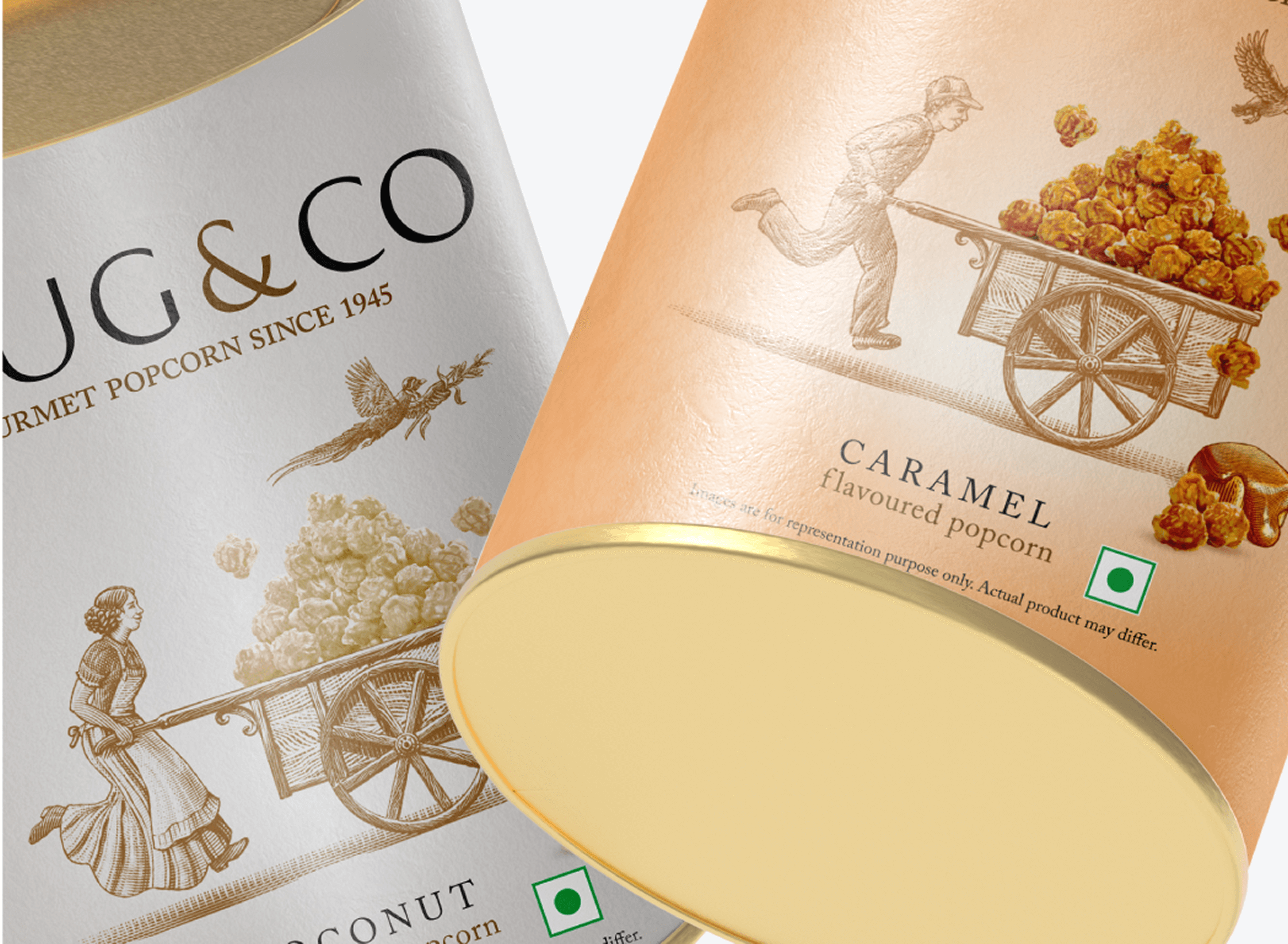
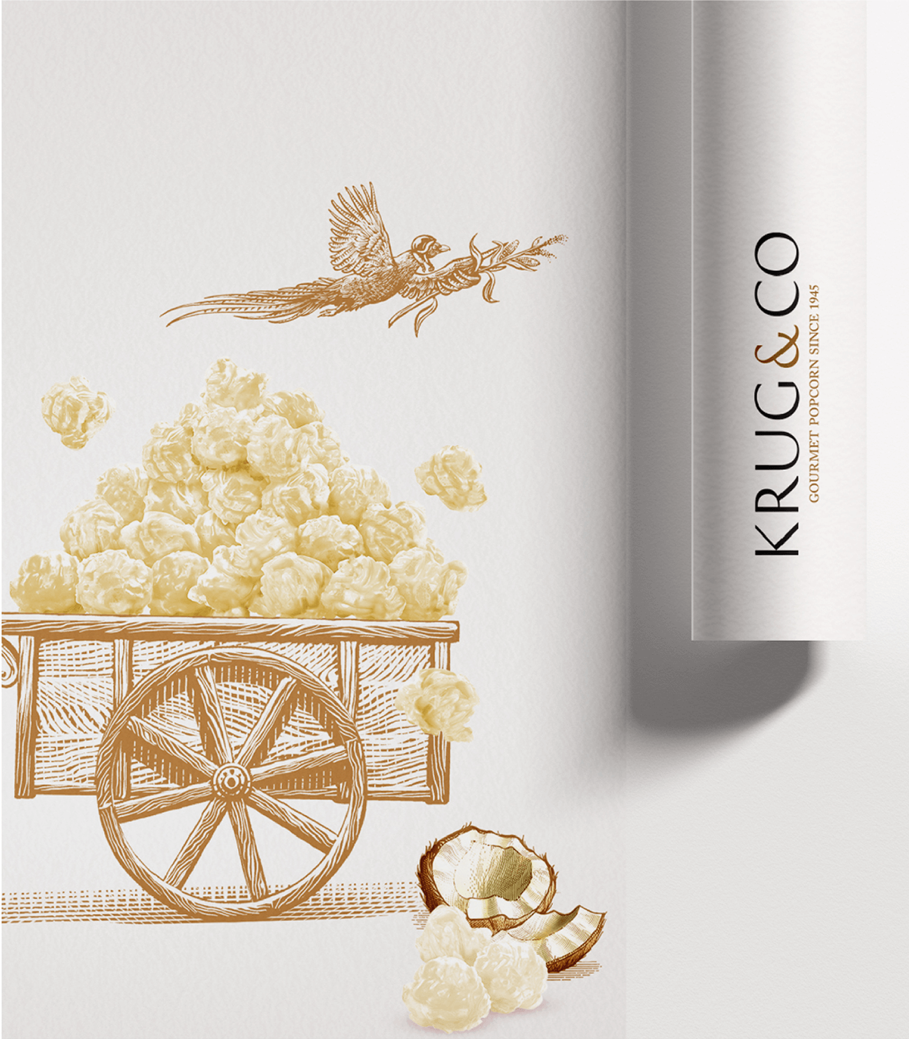
Krug and Co. isn’t just another popcorn brand. Its story began on a Kansas wheat farm in 1916, with Robert Harvey Krug, a farmer who survived the Dust Bowl, dropped out of school to support his family, and eventually found his calling in popcorn.
What started as a small operation grew into Preferred Popcorn, led by his son Norm Krug, and today serves millions around the world, including moviegoers right here in India.
Our Role
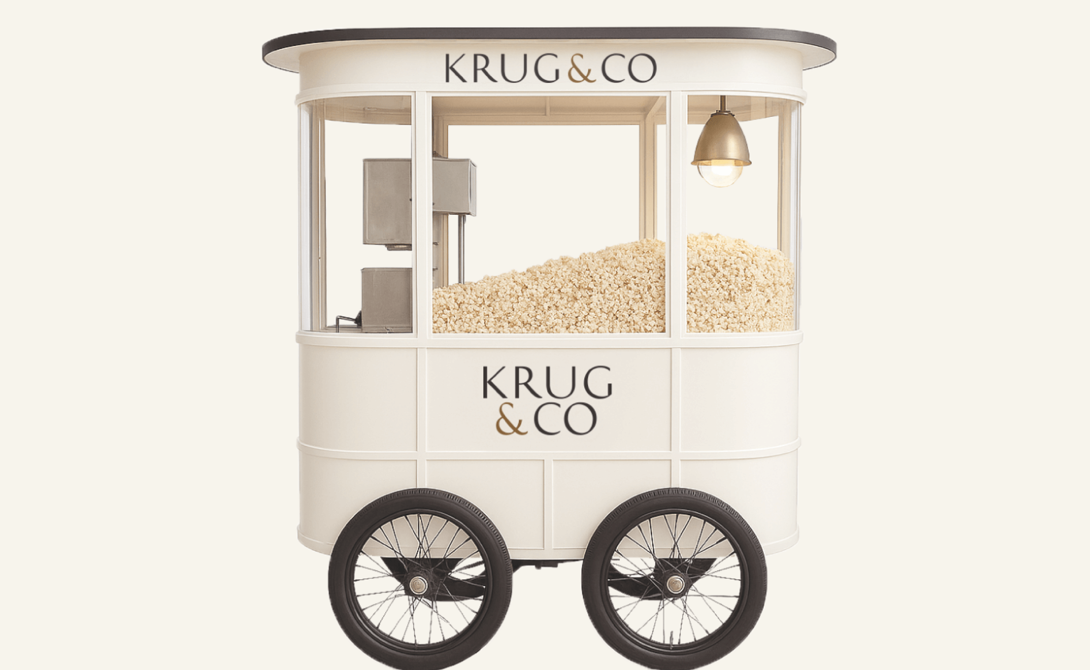
At Rubecon, our task was to design popcorn carts that could carry this legacy forward in a way that felt premium, purposeful, and rooted in history. The carts had to reflect the craft and care that went into every kernel, without shouting for attention.
The final designs drew inspiration from classic Americana and farm-fresh cues, while keeping things sleek, minimal, and modern. With a muted pastel palette, subtle typography, and clean lines, the carts became vehicles for storytelling, inviting people to not just grab a snack, but experience a legacy.
The Result
The Krug and Co. carts became a visual extension of the brand’s values, simple, honest, and timeless.
It is proof that even an ordinary popcorn cart can carry a hundred years of history, if you design it right.