For years, Ibaco has been the go-to destination for some of the most exquisite ice creams. Its ‘choose–scoop–topping–serve’ format was the first-of-its-kind to be rolled out at such a large scale. Until now, this indulgent experience was available only at Ibaco parlours.
The brand was built around strong source stories – tracing each flavour back to where it all began, from Californian pistachios to Belgian chocolate. The origin became a part of the identity. And ibaco began to firmly establish itself as every customer’s favourite ice cream destination.…
The Brief:
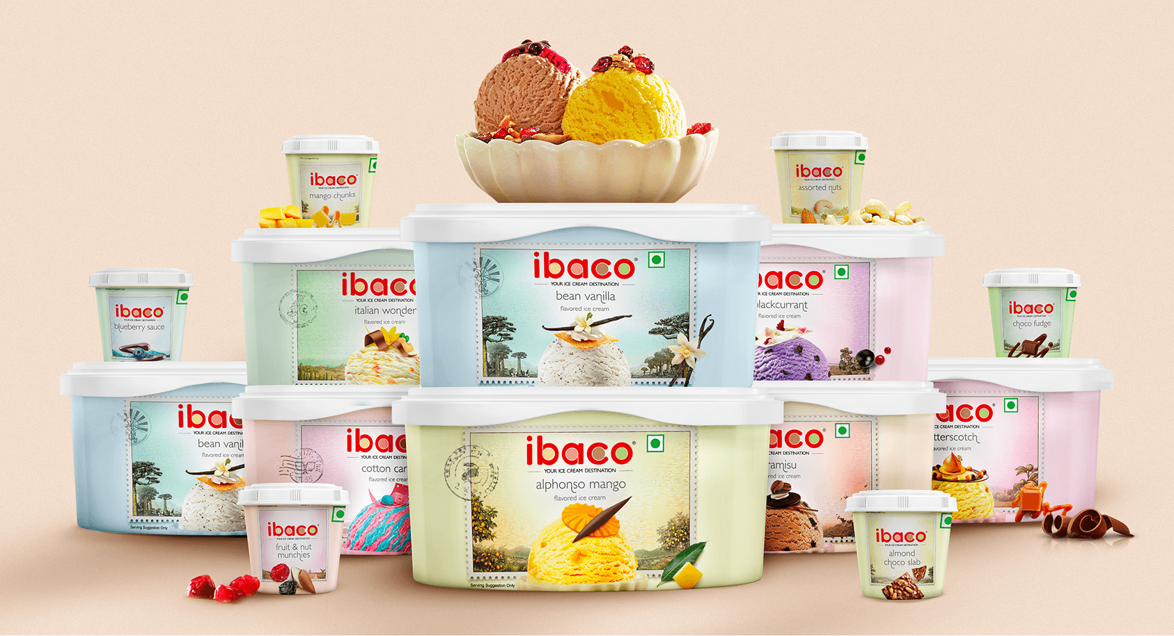
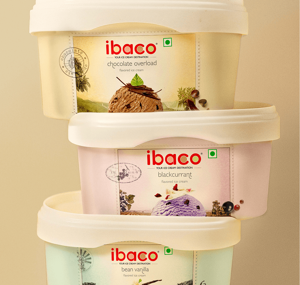
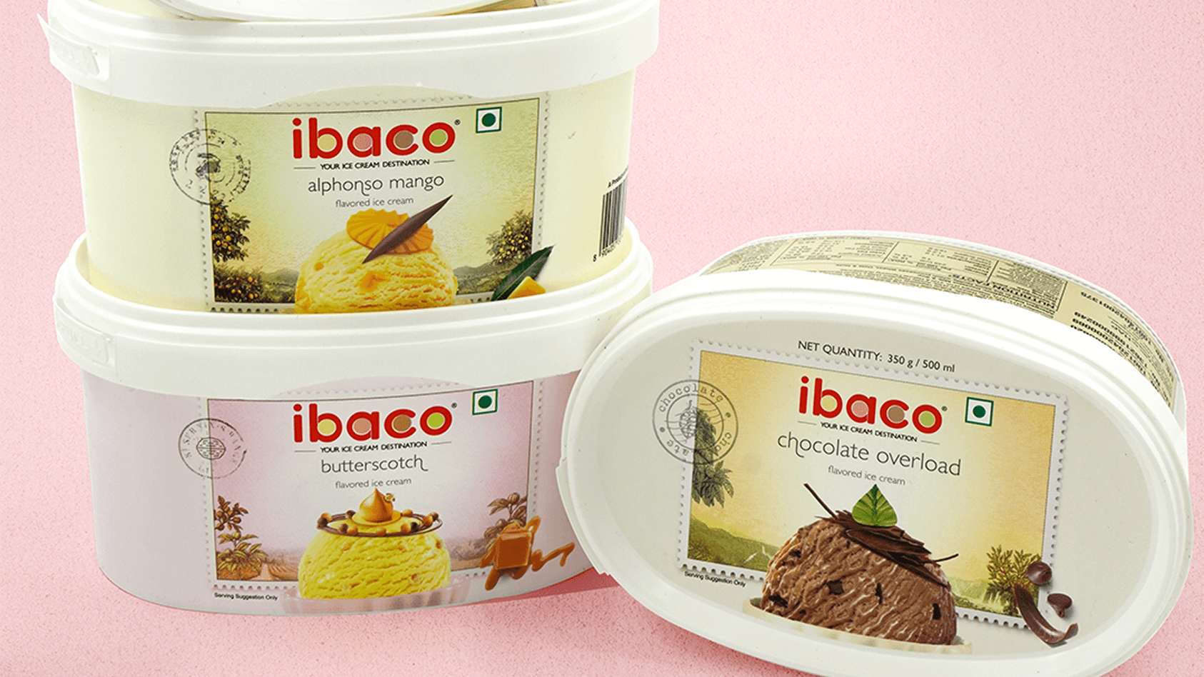
Now, for the first time ever, Ibaco wanted to give customers a different experience – one where they could craft their own sundaes at home with a range of ice cream tubs and toppings. In a way, this new format lets customers ‘bring the ice cream parlour home’.
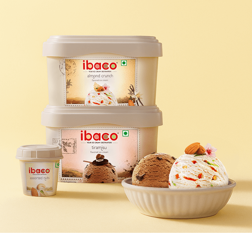
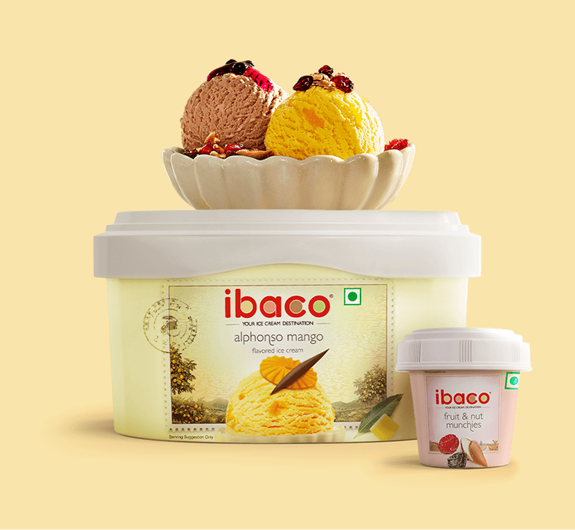
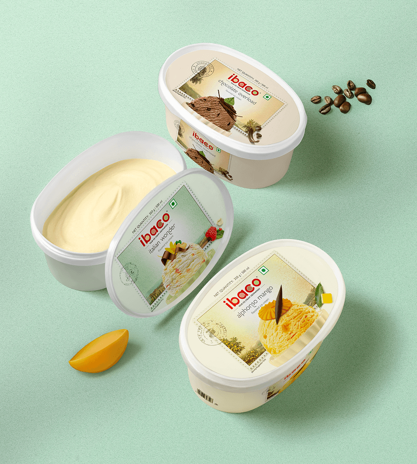
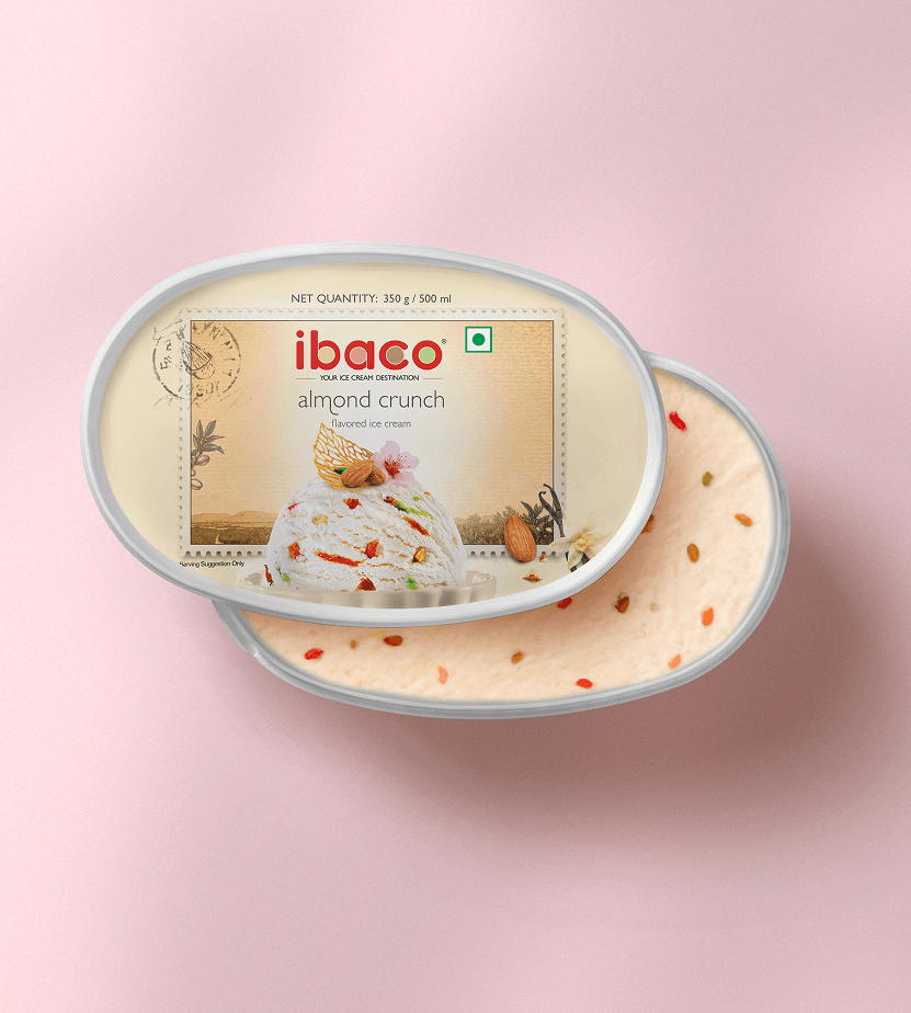
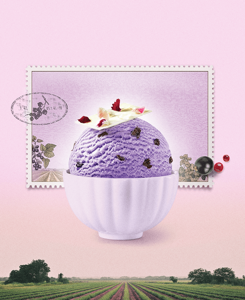
We set out to create a range that stands apart – visually distinct, yet aligned with Ibaco’s signature style of placing the product and its source story at the heart. We crafted stamps and seals as a mnemonic, each one tweaked from the original marks and seals of the ingredient’s country of origin.
Inspired by the stamps and seals of the country of origin, they evoked charm, authenticity, and a sense of coming from afar – like a mark of quality or a passport to flavour.
Rooted in classic philatelic design, these were brought to life using scratchboard – one of the commonly used techniques – to capture the spirit of each place with care, while maintaining Ibaco’s ingredient source story, and its airy, minimal visual language.
With appetizing ice cream shots taking centrestage, the stamps served as more than just visual accents – they became a simple yet powerful storytelling device.
Each one subtly connected the flavour to its origin, tying the entire visual identity back to the product in a way that felt both intentional and evocative.
The toppings pack echoed the same visual language, creating a seamless synergy that reflected the brand’s essence, while distinctly setting it apart from ibaco’s regular offerings.