Giving a High-Performing Brand a High-Impact Presence
Brand Identity | Print & Outdoor
Campaign Design
Building a Brand the Youth Could Swipe Right On
Make LatentView look like what it truly is, not what people assume an analytics company is.
A place where 20 to 30 year olds aspire to belong – distinct, vibrant, smart and above all, cool.
Talent acquisition was the entry point. Investor confidence was the bigger picture. Campus impact and office presence were the final finish.
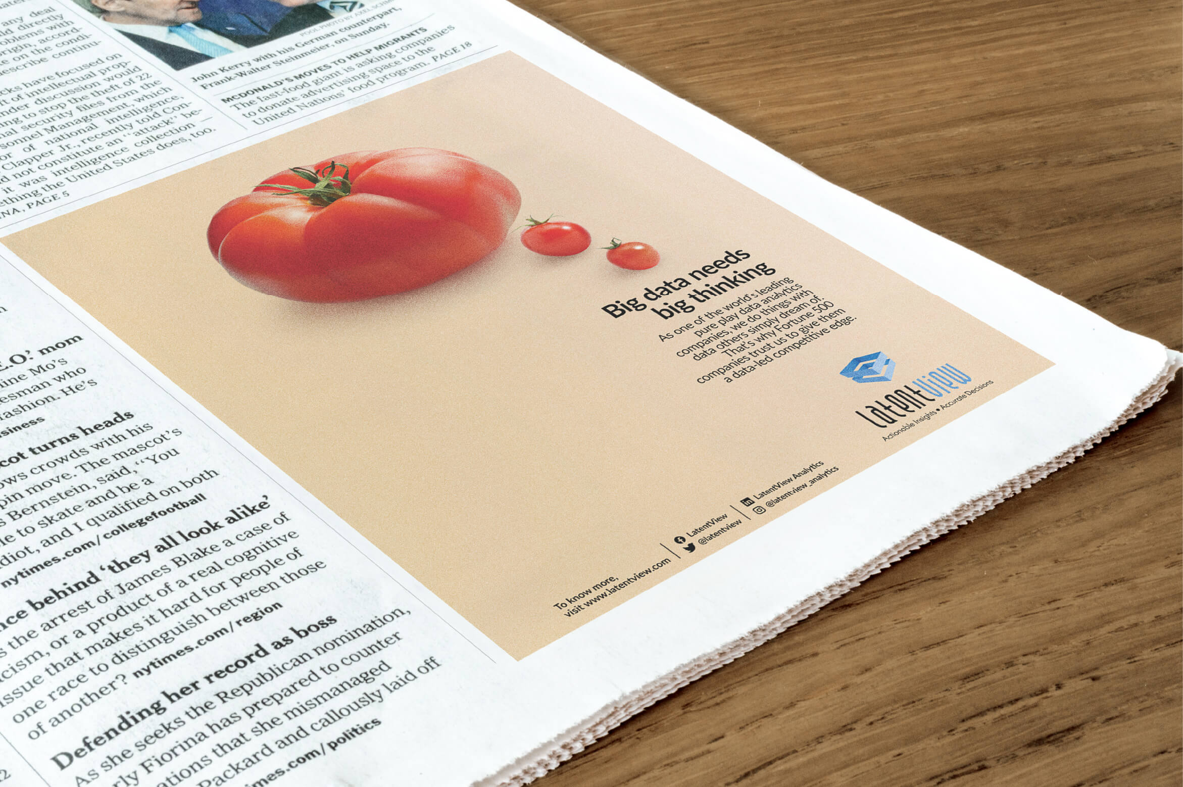
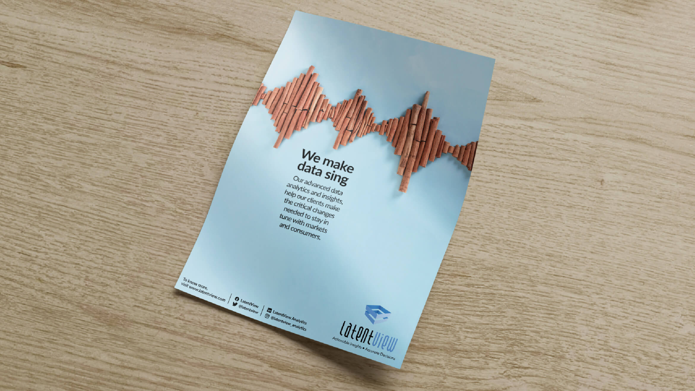
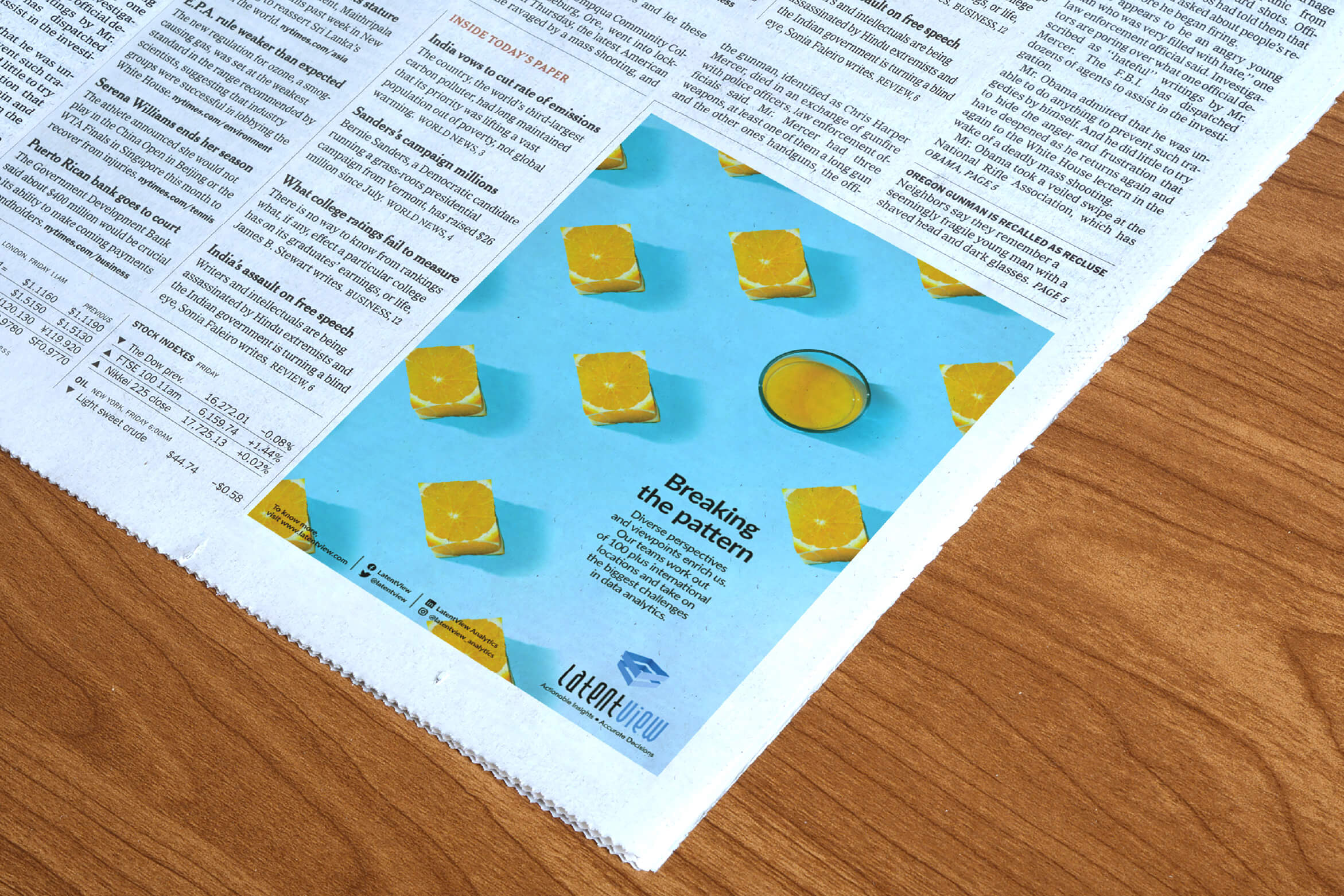
Data Isn’t Boring, So Why Should Branding Be?
Brands in the analytics space often end up looking identical with Futuristic grids, floating holograms and abstract networks. LatentView wanted to do better. They were a pure play in analytics, trusted by the biggest brands in the world. One third of their workforce were women. Over a hundred employees held global roles. They were the first to list publicly.
The brand needed a distinct personality.
The recipe for standing out
Move away from tech-for-tech’s-sake visuals and build a world around something simple, familiar, and impossible to miss. We used food elements to create disruptive, sticky visuals, turning everyday ingredients into patterns, analogies, and bold graphic metaphors.
Visual elements people naturally gravitate toward became the foundation of a signature system. It carried across posts, prints, and spaces, playful enough to attract young talent, smart enough for investors, and flexible enough to hold any message without ever losing the LatentView stamp.
Bright, energetic and confident. The opposite of corporate grayscale. A graphic language that travelled effortlessly across campus banners, office walls, ad layouts, and digital posts. Visuals that didn’t look like what people expect from an analytics brand, and that contrast is what drew attention.
A perception shift
The refreshed identity turned talent heads. It made the brand feel young without trying too hard, credible without feeling old, and distinctive without relying on clichés.