When Intergrow (creators of the popular Kitchen Treasures brand) decided to enter the Tamil Nadu market, it wasn’t stepping onto easy turf. The shelves were already spoken for by Aachi and Shakti. But the brand carried something worth fighting for – confidence in its quality and taste. The brief was clear: Tamil Nadu deserves a masala brand that sets a superior standard. The light bulb thought; to make that message resonate, we needed more than just good taste. We needed a cultural identity.
The Secret Ingredient
In our exploration of Tamil Nadu kitchens, we stumbled upon something more powerful than spices and recipes – purity and genuine intent. The everyday rituals, the kolam drawn at the doorstep, the quiet strength of women who keep traditions alive, all of it pointed to a deeper truth. That insight became our anchor: the brand needed to feel authentic, rooted, and unmistakably Tamil.
We turned this truth into a name: Meiyal. In Tamil, ‘Mei’ means truth. Meiyal embodies a woman of pure intentions, a symbol as timeless as the kitchens we were designing for.
Now, how do you make truth stand out on a crowded shelf? You give it design consistency.
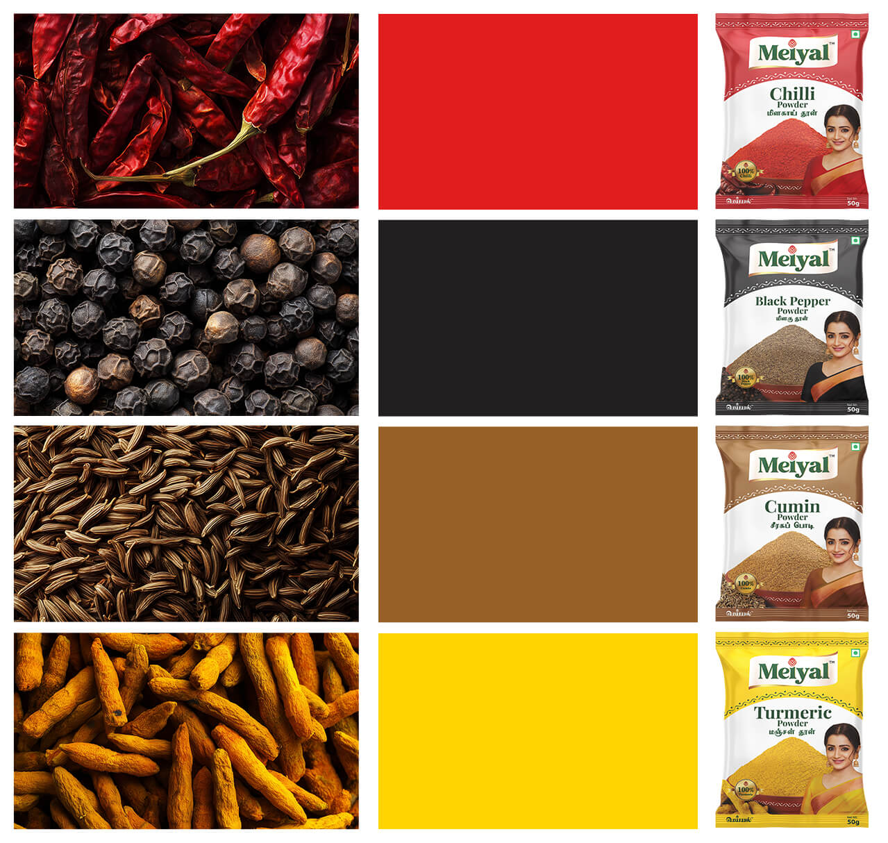
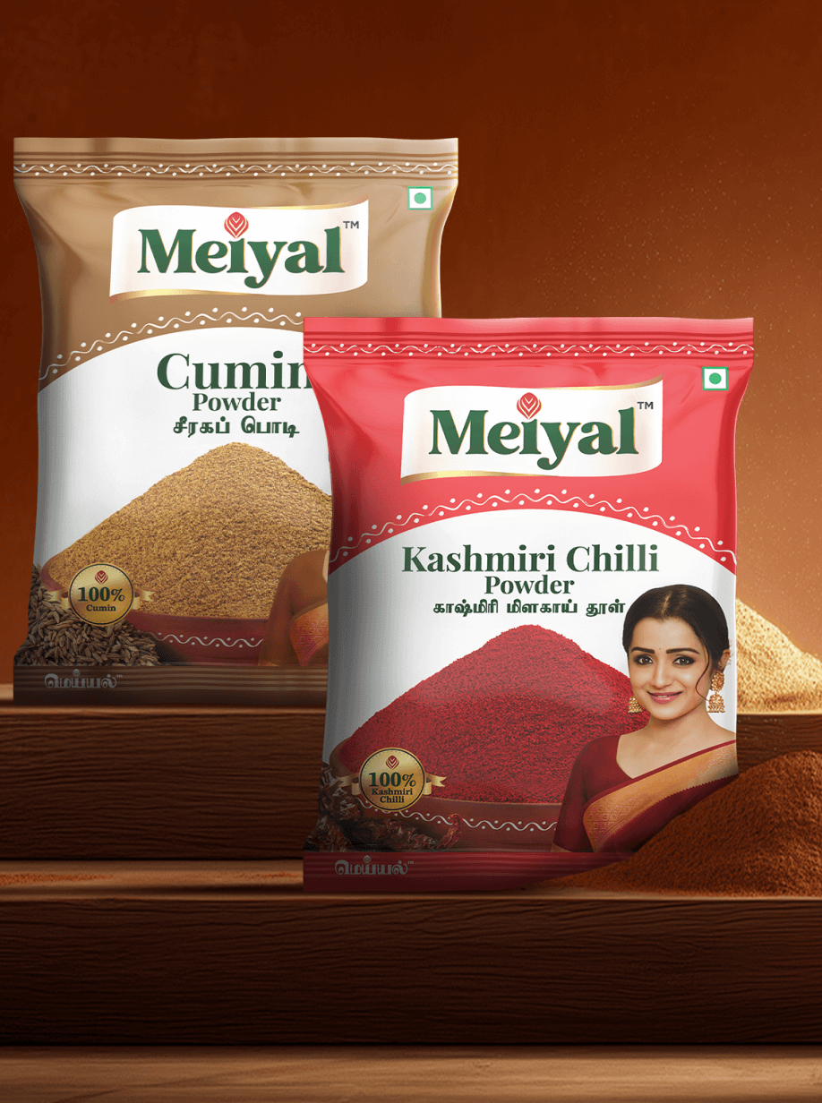
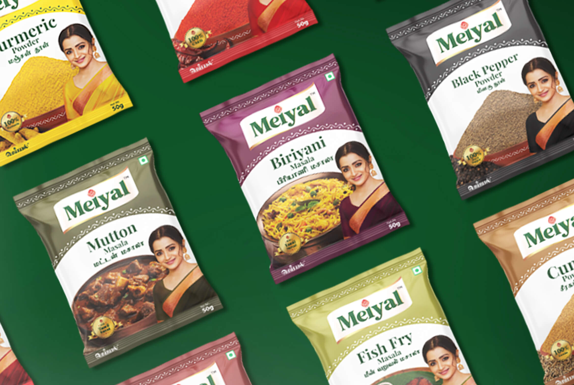
A bold colour band that runs across every pack, creating instant recognition when stacked.
A kolam motif, reinterpreted in clean lines and dots, connecting the packaging back to the heart of Tamil culture.
A logo born of a peacock feather and a flame — a balance of grace and strength, inspired by the spirit of Tamil women.
The Impact
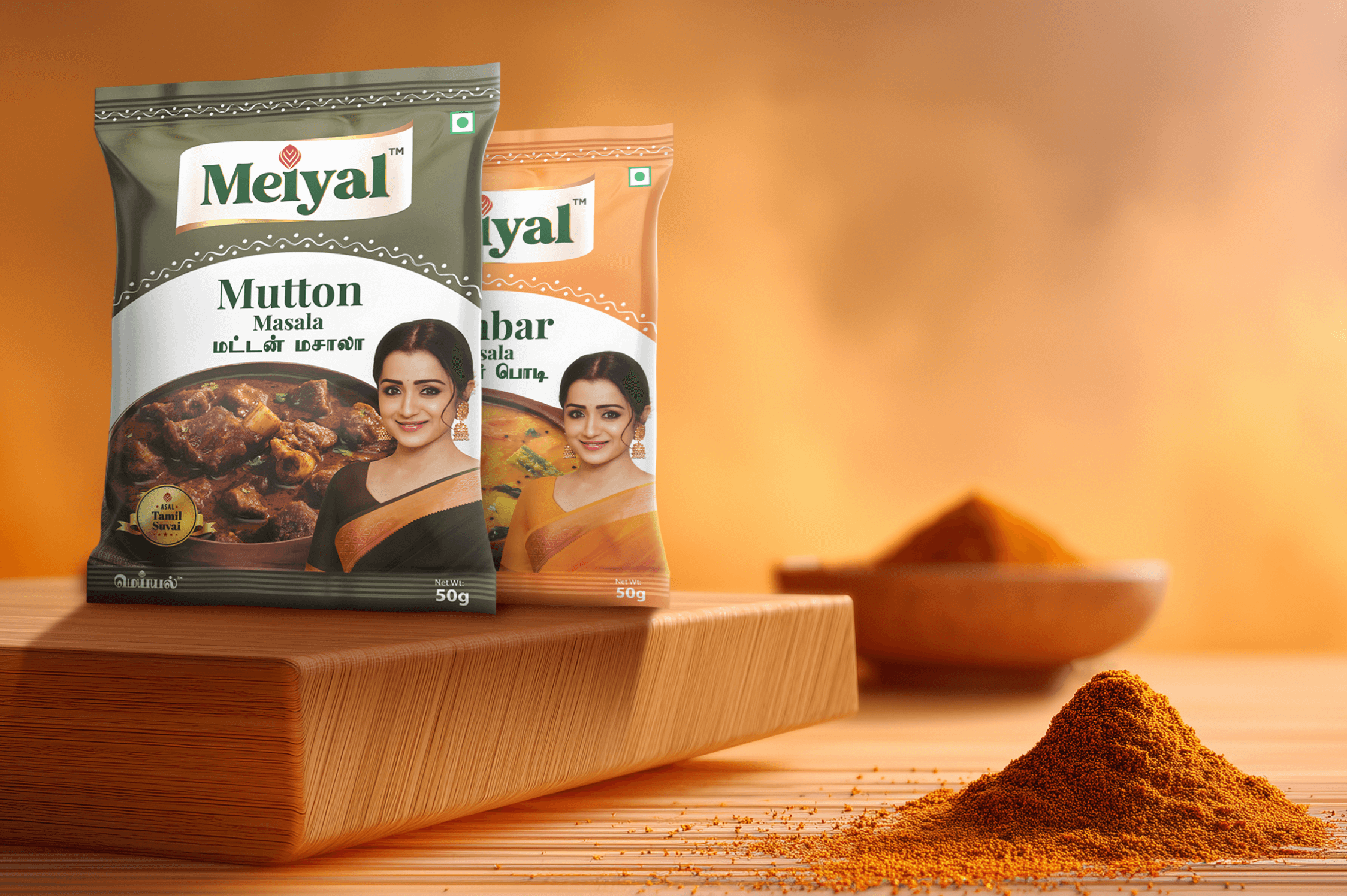
The result wasn’t just packaging. It was an identity. A brand that walked into Tamil Nadu kitchens not as a guest, but as someone who already belonged there. By combining cultural truth with clever design, Meiyal became more than a masala brand. It became a story on the shelf, one that Tamil Nadu kitchens were ready to welcome.