A visual identity system built on clarity, confidence, and inclusivity.
Good design starts with clarity
Truser is more than a clothing brand, it’s a philosophy that celebrates inclusivity, individuality, and fearless yet playful self-expression. The brand is a fresh new start from the creators of Liberty Shirts and ColorPlus. The brand philosophy is rooted in the belief that style has no boundaries, championing a ‘free to wear what you want to wear’ ethos. Our task was to create a visual identity that embodied this spirit and set the foundation for a brand that refuses to conform.
The Logo
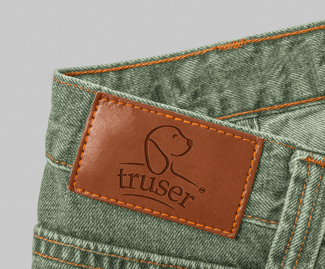
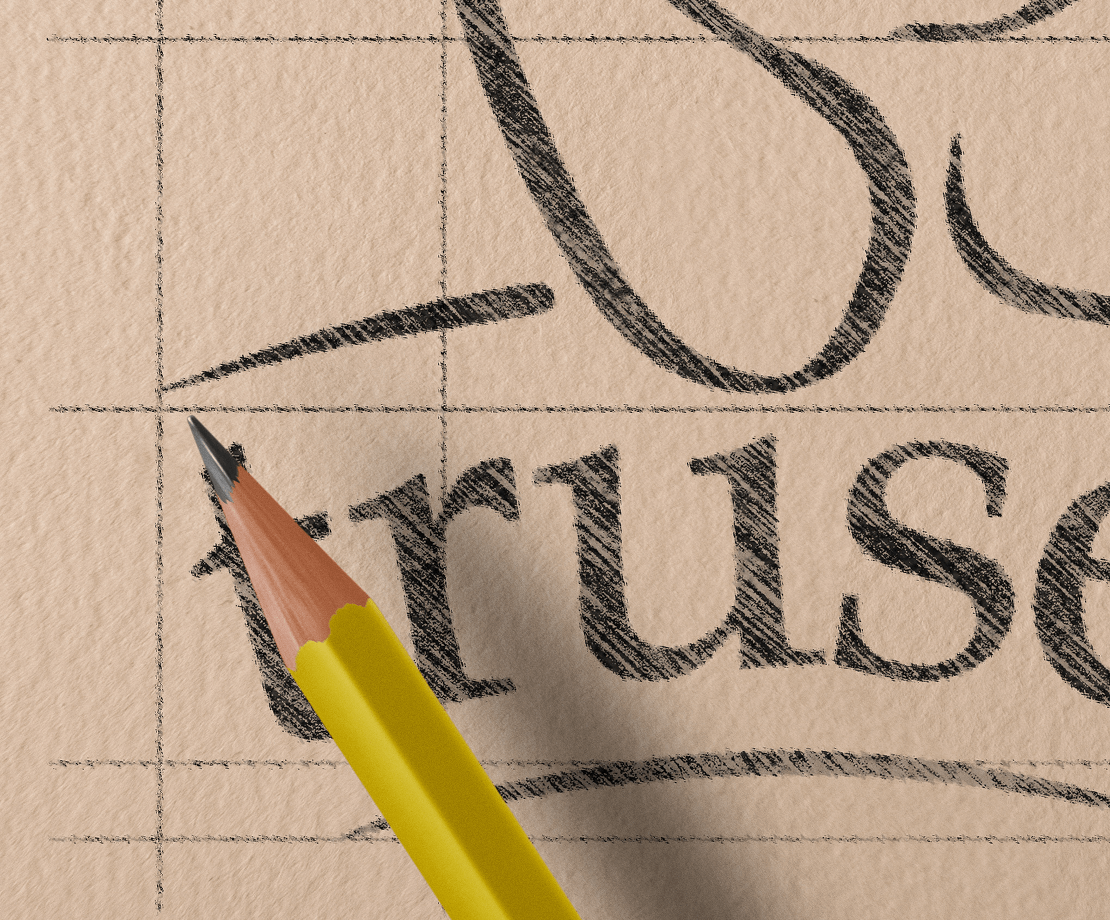
At the heart of Truser’s identity is its wordmark, designed for versatility and impact. The warm monogram reflects the team’s love for dogs, conveying a sense of playfulness and more importantly, loyalty. Truser’s partnership with The Blue Cross further reinforces this ethos of compassion and community. The clearspace around ensures the logo always communicates with clarity and purpose, no matter the medium.
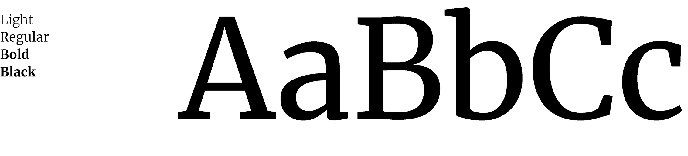
Typography plays a central role in Truser’s voice. We paired Merriweather as the primary typeface embodying confidence, groundedness, and expression with Lato as the secondary typeface for subheads and supporting text. Together, they create a balance of style and readability, reflecting the brand’s dynamic yet friendly personality.
The Colours
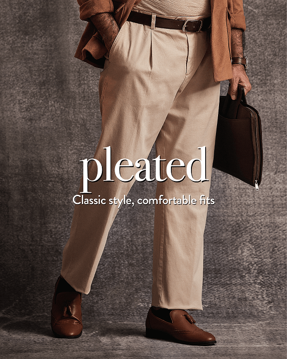
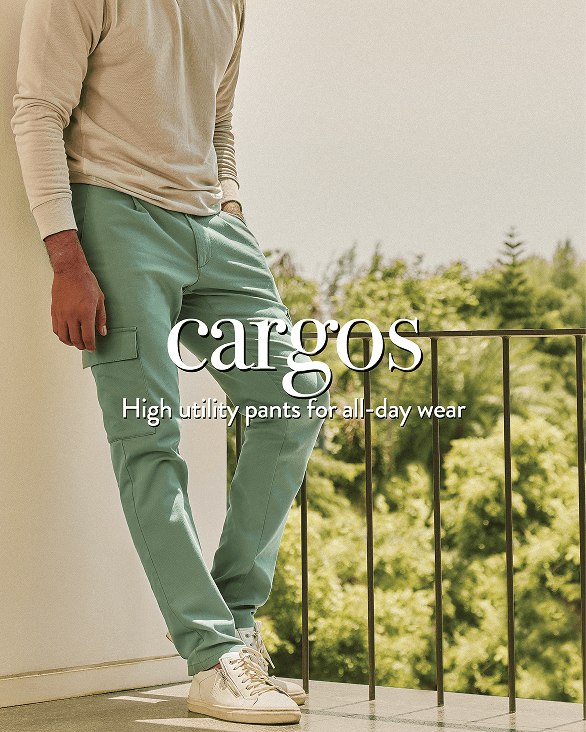
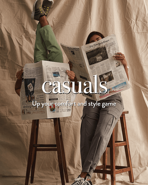
As a fashion brand, Truser embraces limitless possibilities. With a wide core palette, the brand seamlessly adapts to trends, moods, and product lines, staying instantly recognisable yet always fresh, relevant, and fashion-forward.
An identity designed to move
Whether on a clothing tag, a billboard, or a digital ad, Truser’s logo was crafted to travel seamlessly across platforms. Uncompromising, inclusive, and timeless, just like the brand itself.