It was the IPL season of 2025, a time when cross-brand collaborations were making waves across industries. Amidst the excitement, we had the opportunity to be part of a unique three-way alliance between three trusted names: City Union Bank, Chennai Super Kings, and Sunrisers Hyderabad.
Preparing the Pitch
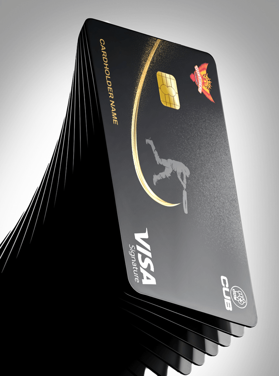
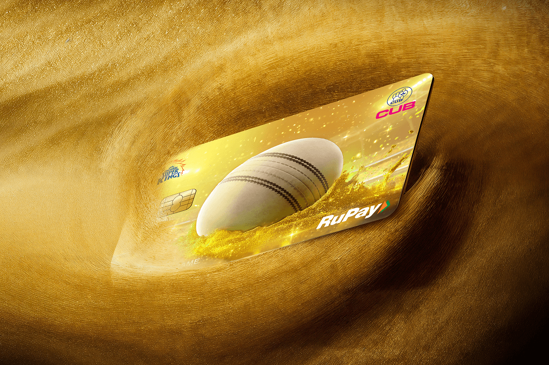
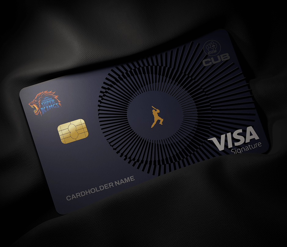
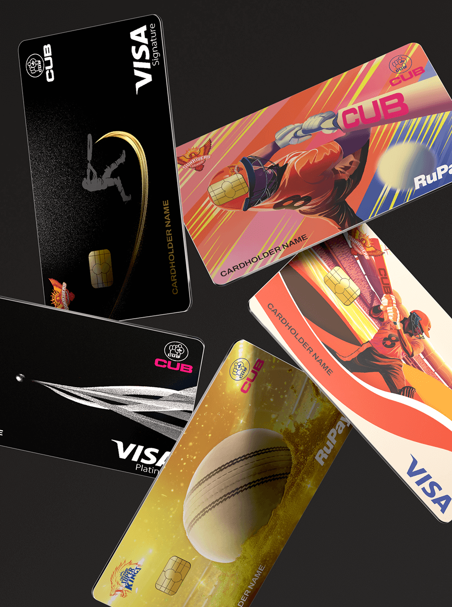
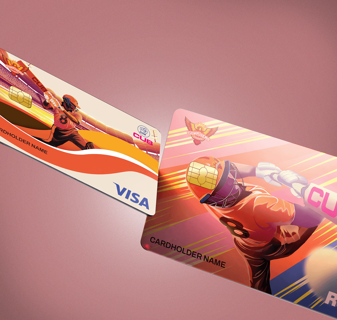
The mandate was clear: in collaboration with Chennai Super Kings and Sunrisers Hyderabad, City Union Bank wanted a suite of co-branded credit cards that proudly showcased each team’s identity. From CSK’s roaring lion energy to SRH’s fiery dynamism, each card needed to reflect the teams’ colours, symbols, and spirit while catering to distinct customer segments. Spanning an entry-level mass card, a mid-tier premium, and an exclusive signature card, the challenge was to merge the bold essence of the franchises with the trust and credibility of the bank.
The card designs were crafted to speak the language of every fan segment. For the mass range, it was all about colour, energy, and drama, angled patterns, bold colours, and cricket-inspired intensity that wore passion on its sleeve. SRH’s cards carried a wave motif to echo the roar of their fanbase, while some editions blended CUB’s pink and blue with team flair for a seamless co-brand connection.
As the tiers climbed, the designs grew quieter but stronger. Premium and signature cards leaned on elegance, silver for platinum, gold for signature, elevated with embossed effects, layered textures, and iconic symbols. From CSK’s roaring lion to SRH’s batting silhouette frozen mid-swing, every detail was a nod to the game, but with the sophistication expected from a bank card.