Brand Identity | Packaging | Film & Video | Campaign Design
A Monumental Language
Most chocolate brands feel light. Sweet, playful, indulgent. They decorate. They romance. They’re soft.
We didn’t want that. Havia needed to feel like the opposite. Something with gravity. Something that stands. A brand that feels like it could be carved in stone.
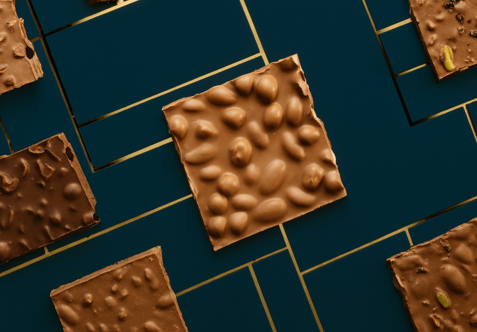
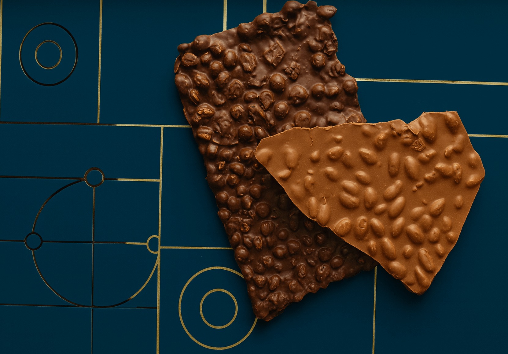
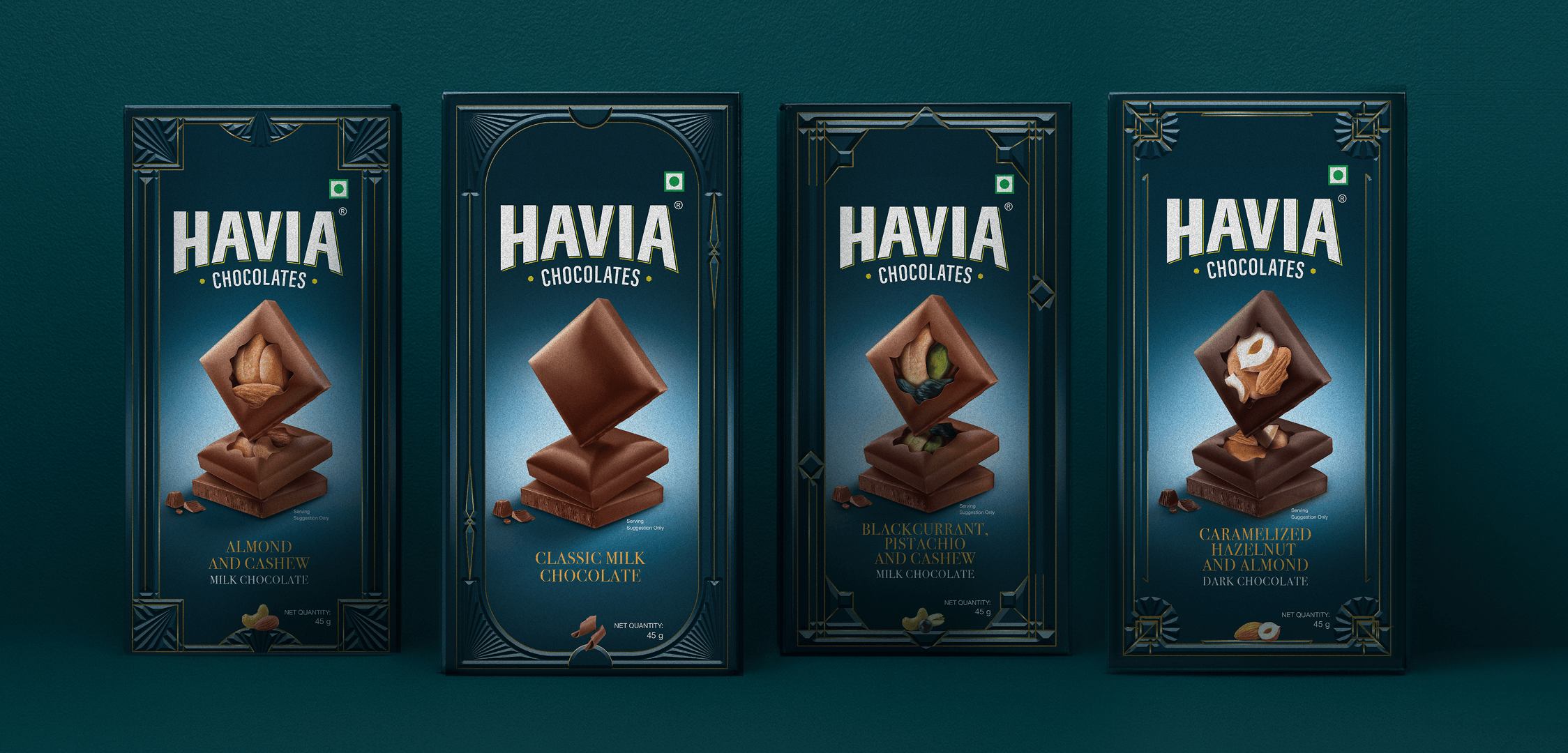
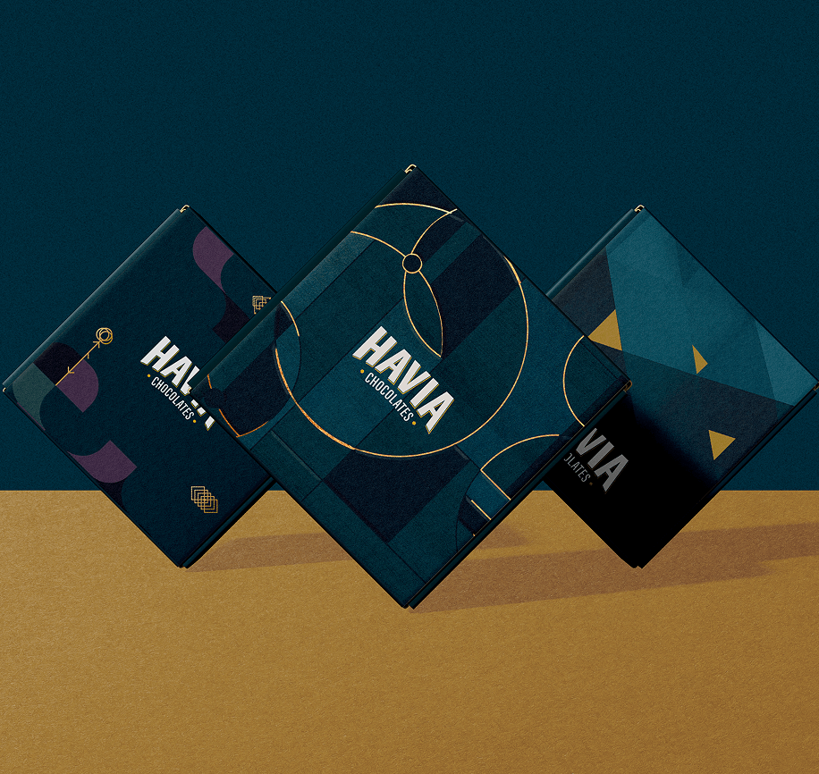
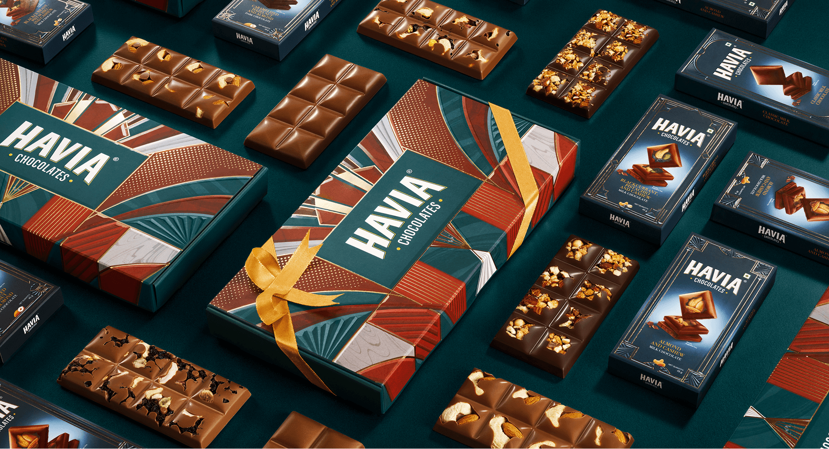
When we thought about what that meant visually, we kept coming back to geometry. The strength of lines, symmetry, and forms that are balanced and enduring. Once we set our minds on that, it was just a short leap to Art Deco. It’s an art movement of European lineage that has a sense of monumentality which adds structure to decoration. We reinterpreted its visual codes: chevrons, and radiating forms not as nostalgia, but as a modern architecture for the brand. The result is an aesthetic that feels both timeless and contemporary: serious, gender-neutral, and enduring.
Precious by Design
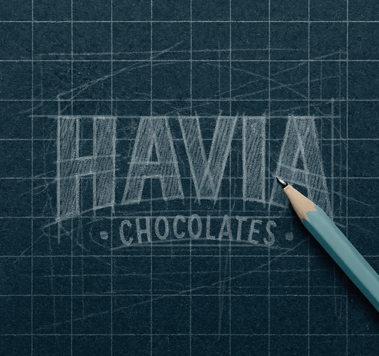
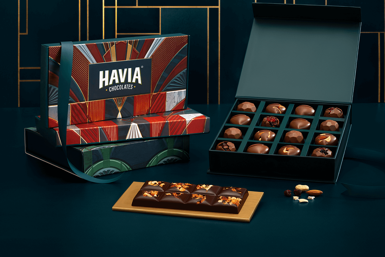
As mentioned, we wanted the brand to convey structure, not decoration; precision, and not prettiness. The word “precious” played a key role in our thought process as well. Not in the fragile, sentimental way, but in the way of value – crafted, rare, and something you want to keep. We wanted the logo to embody all of these sentiments.
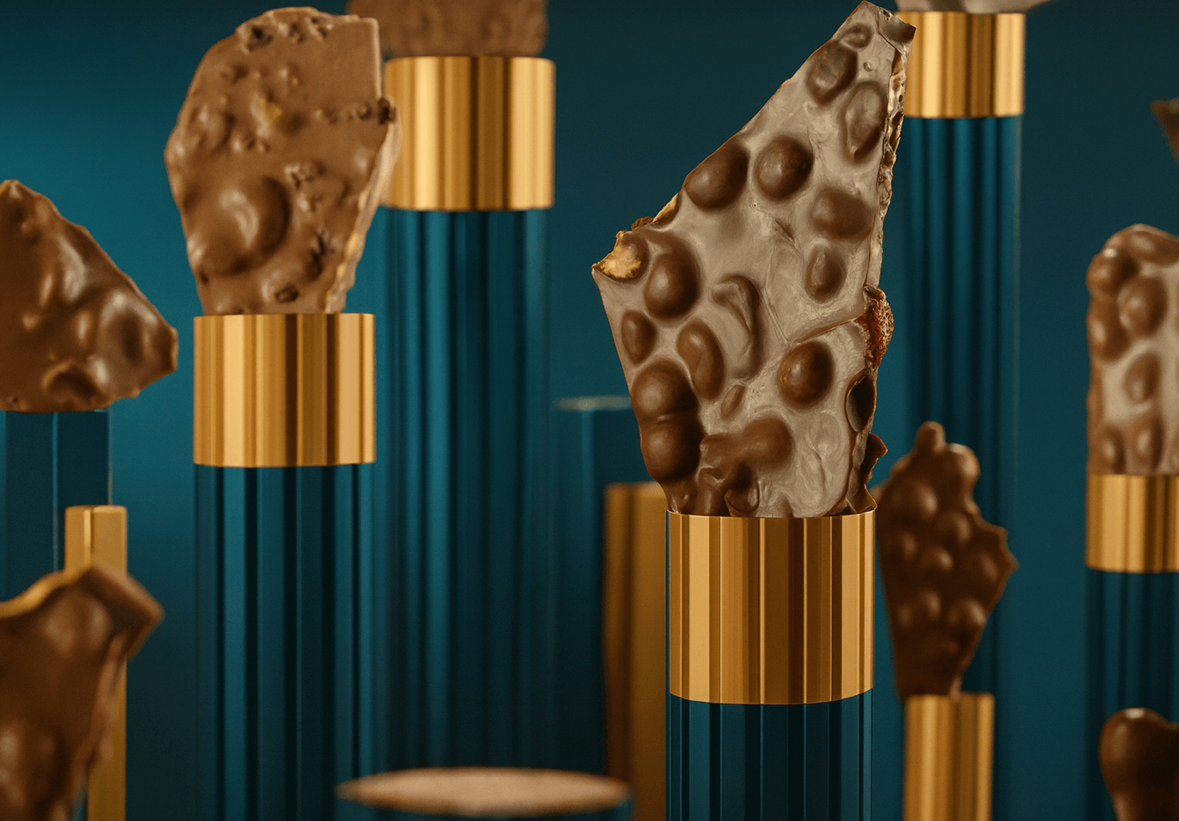
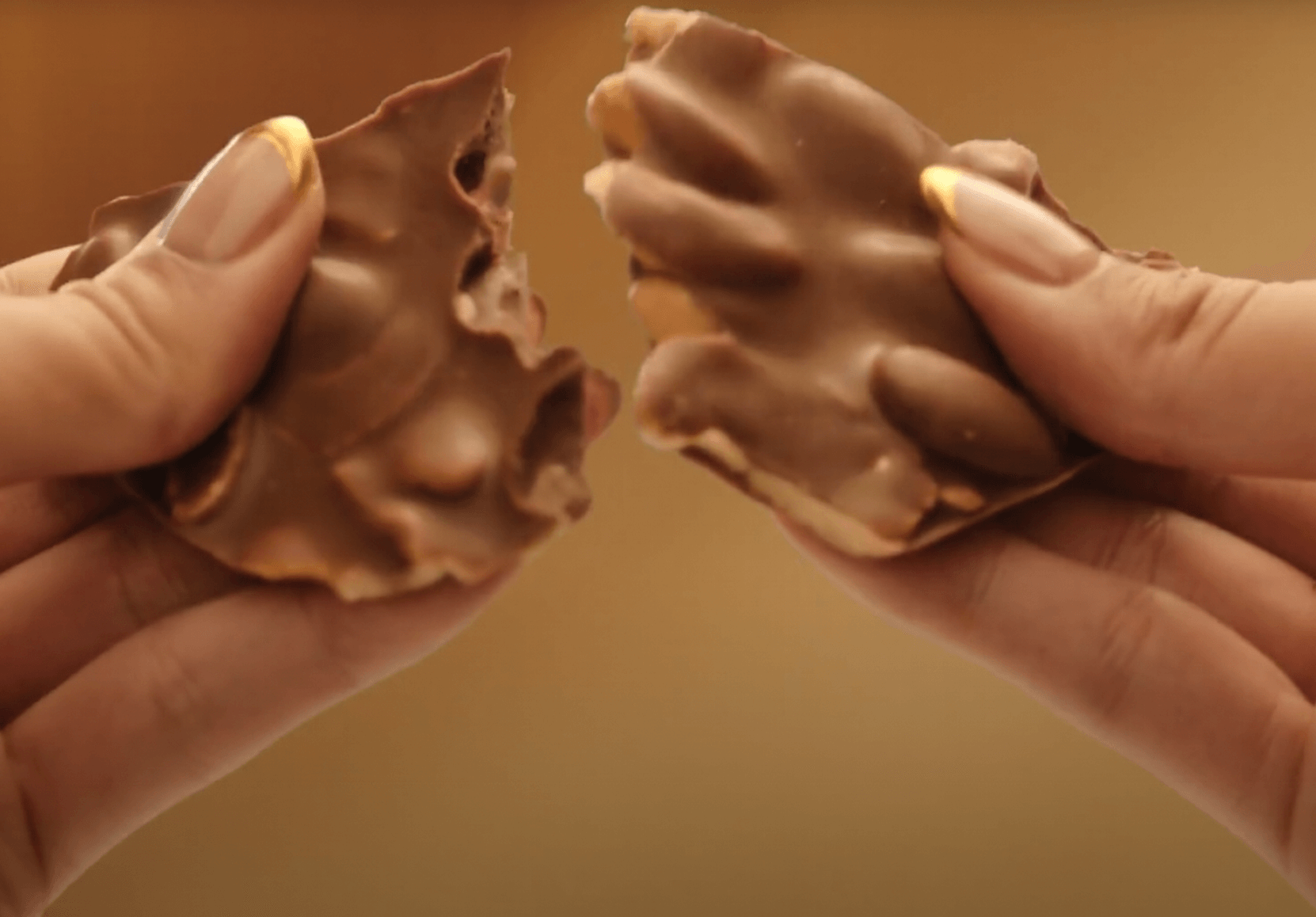
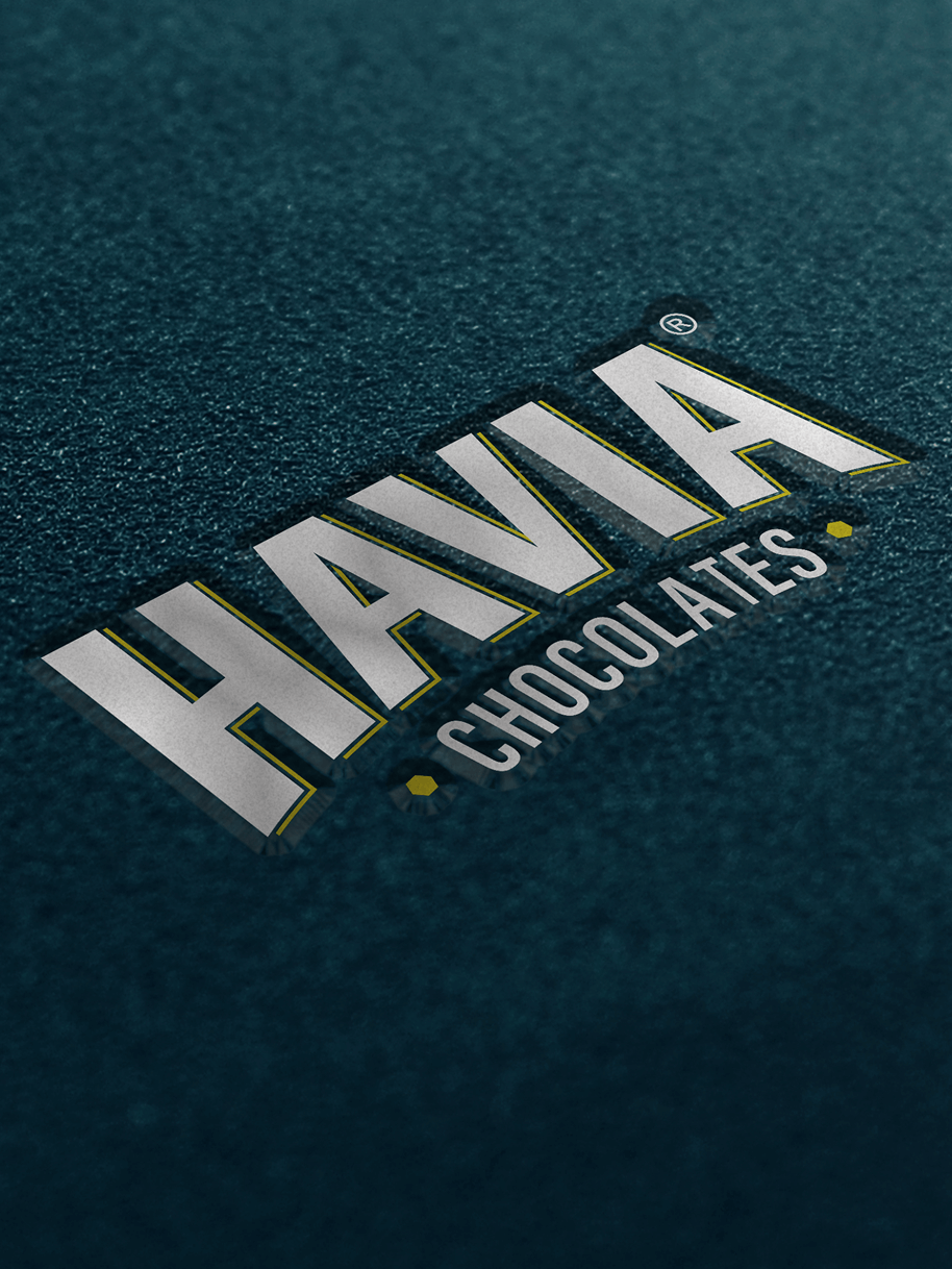
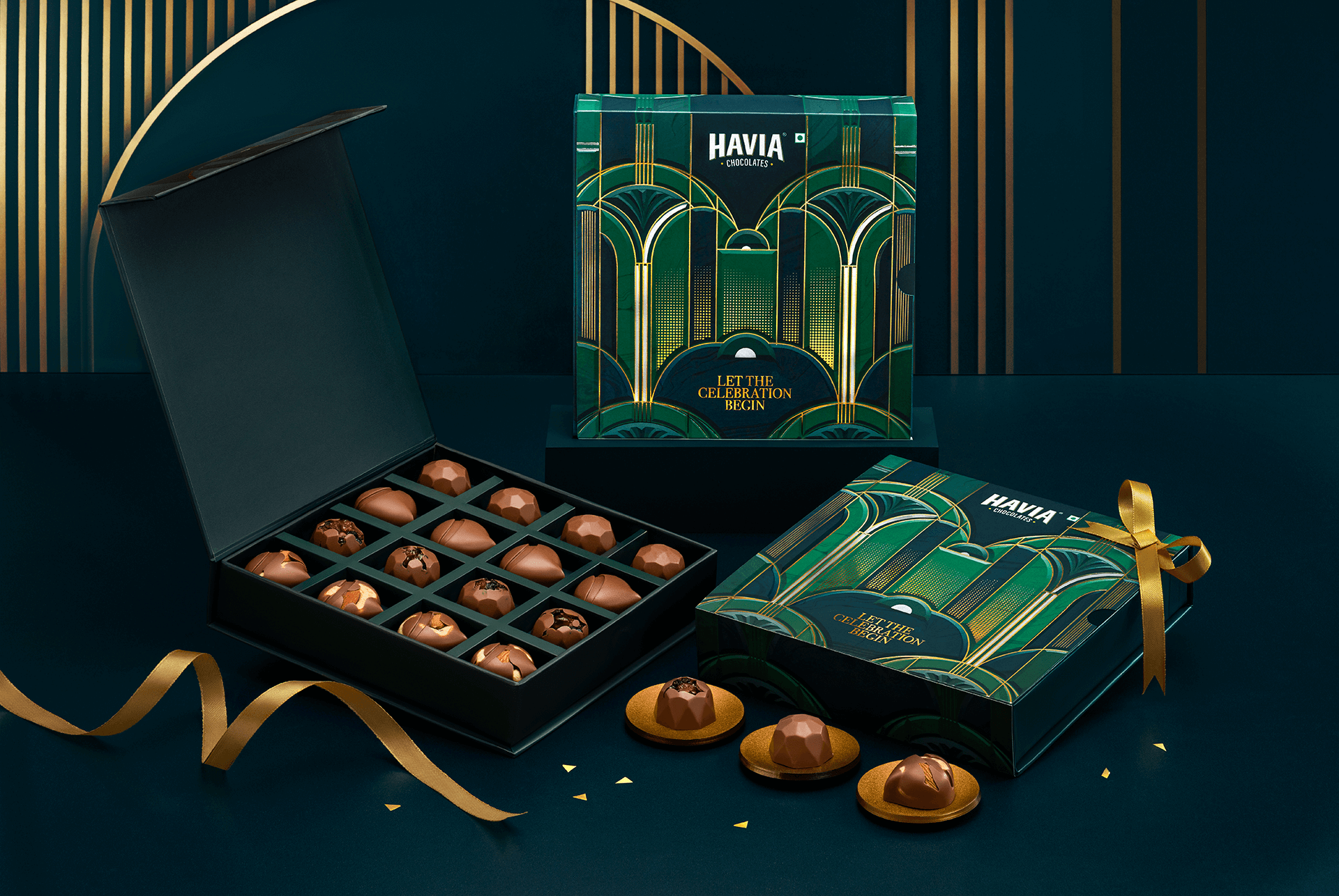
Colour plays a restrained but powerful role. A deep, resonant blue anchors the palette, while touches of gold and silver bring a sense of rarity. Finishes and textures elevate every pack beyond packaging, turning it into an object of cultural value. The end result is a logo that is strong, monumental, and distinct, featuring a bold wordmark for instant recognition, with Chocolates placed below to reinforce the brand offering. The chocolate itself is treated like a sculpture: moulds and forms designed with the same architectural precision. When you hold it, when you gift it, when you taste it – there should be a sense that this is crafted like art.
We wanted Havia to be about the craft itself. About chocolate elevated to an art form. We even coined the phrase “Pure Chocolate Artistry” to reinforce the brand’s essence. With these brand attributes serving as our north star, we produced a film that showcased opulent and elegant spaces inspired by Art Deco, featuring the products and models whom we felt aligned with the brand. Paired with Western Classical music, it created a sensory journey that conveyed richness, artistry, and indulgence.
Havia does not decorate. It constructs. It does not embellish. It distills. This is chocolate elevated to the level of pure design. Chocolate as architecture. Chocolate as a monument. Chocolate as artistry.