Where design meets the everyday goodness from our villages.
Goodness in every detail.
For nearly three decades, Arokya has been more than a dairy brand. It has been part of families across Tamil Nadu, Andhra Pradesh, Telangana, Karnataka, and Maharashtra. Every pack carries not just milk, but nourishment, trust, and care from our villages. When it came to packaging, our role was simple: translate this promise of goodness with care into a design language dairy consumers can instantly connect with.
Rooted in trust
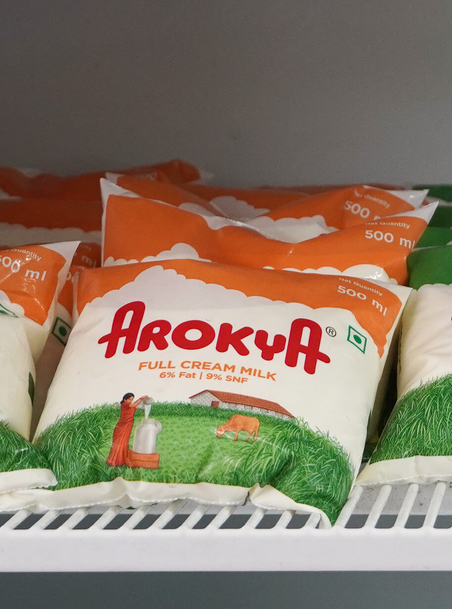
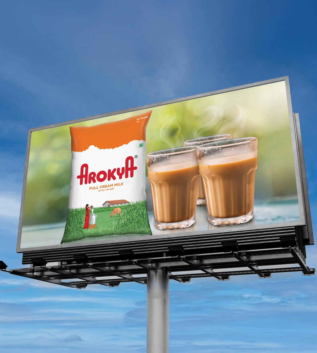
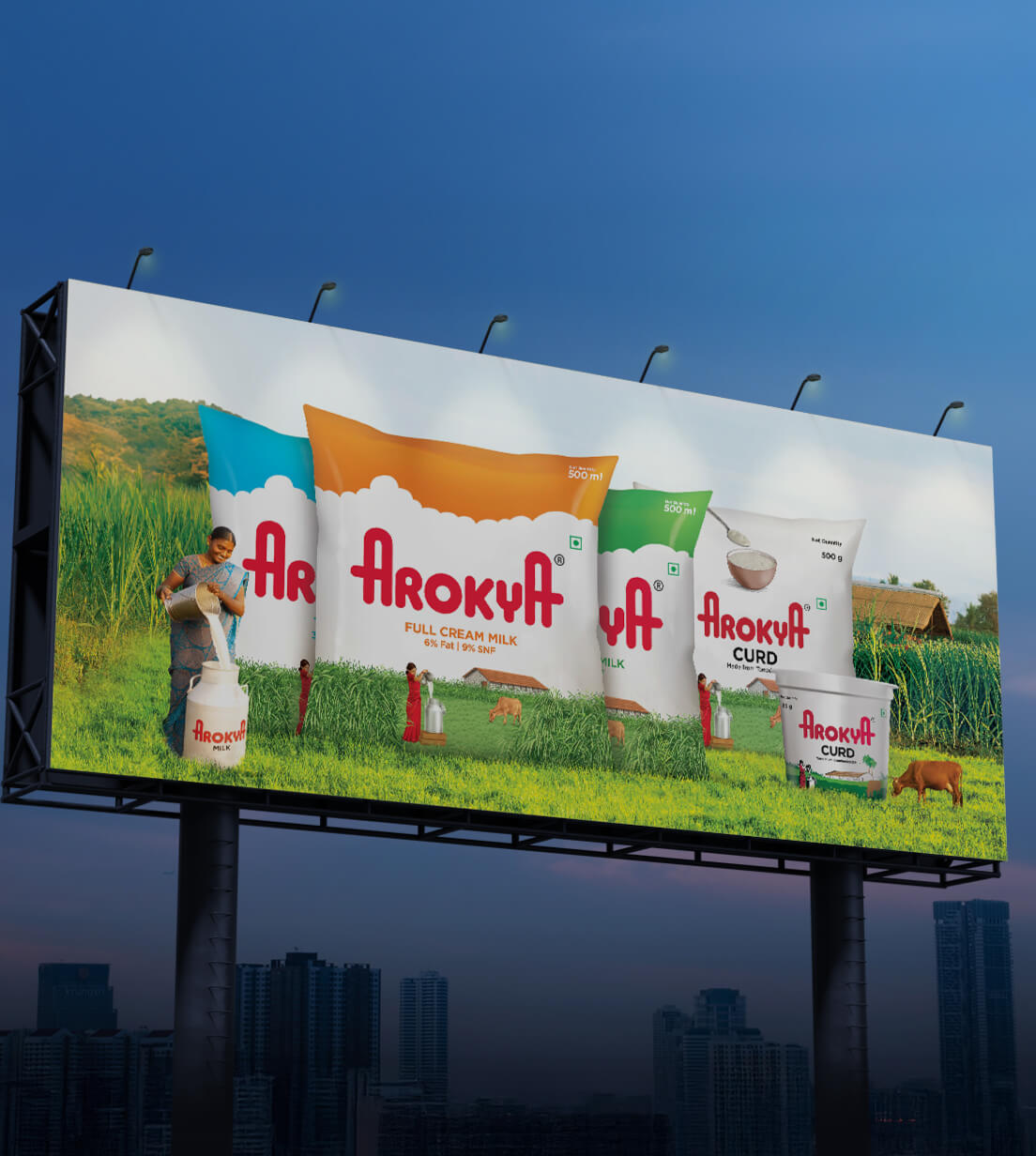
Every element of Arokya’s design carries the essence of care from our villages. The image of a woman in a red saree, milk can in hand, isn’t just an illustration, it’s a tribute to the hardworking farmers who tend to well-fed cattle around green farms. The house in the background, set against fertile fields, echoes the wholesome ecosystem of rural life: clean water, lush grass, and diligent care.
Colours that speak goodness
Our packaging system makes Arokya stand out on any shelf, carrying the vibrant spirit of our villages. The colour codes: orange, green, and blue follow industry norms and are seamlessly integrated into the design to differentiate Arokya’s variants: full cream, standardized, and toned milk. Curd and paneer shine in classic white, a nod to purity and the simplicity of village life.
A design you can trust
Arokya’s visual identity isn’t just about packaging. It’s about preserving the nalam (goodness) and anbudan (care) of our villages. It’s a reflection of fertile lands, well-nourished cows, and families thriving together, delivered with care to yours.